When you think of a brand, most often it’s the logo or color palette that comes to mind. While these are key visual elements, typography plays a pivotal, often underestimated, role in shaping the overall perception of a brand. Fonts aren’t just functional tools for presenting text—they embody the brand’s voice, tone, and personality, influencing how audiences feel and respond to the brand.
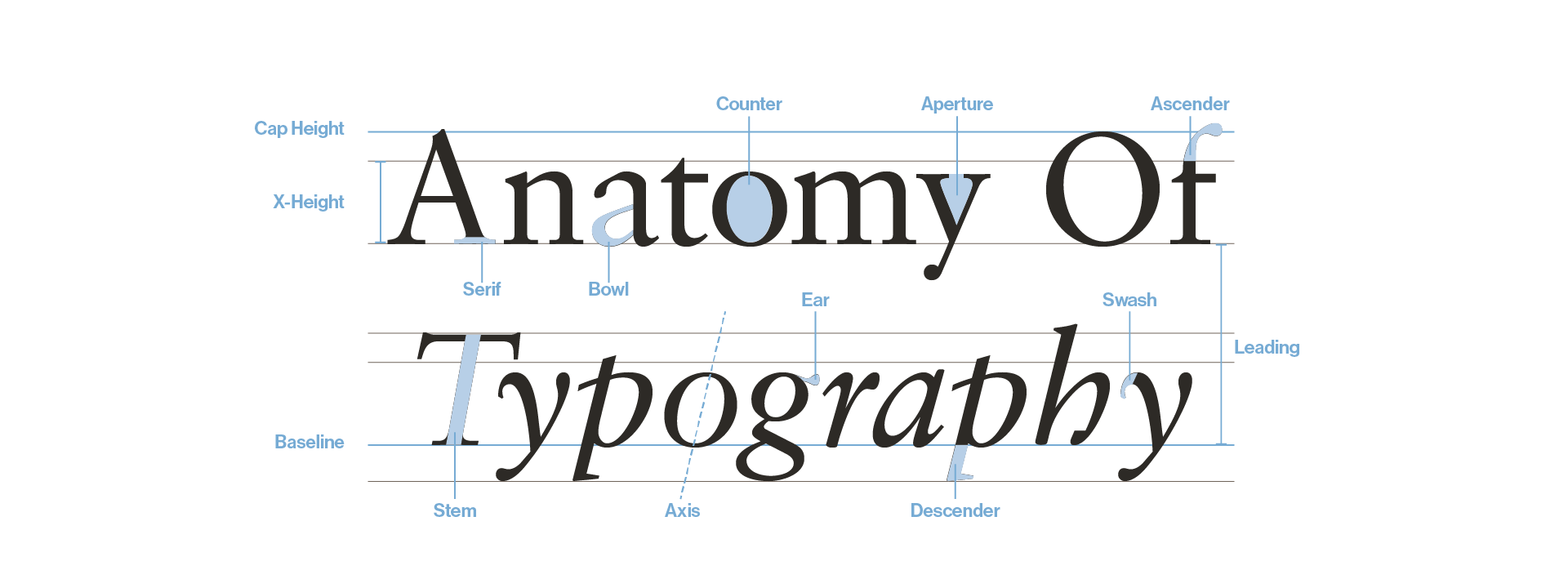
Many of us are familiar with picking fonts from a drop-down menu, but typography goes far beyond font selection. It’s the art and science of choosing, arranging, and typesetting text to ensure it’s both aesthetically pleasing and highly legible. From the point size to kerning (the space between letters) and leading (line height), typography affects how easily content can be read and how it aligns with the brand’s identity.

In brand design, typography isn’t just about appearance—it’s a strategic tool. The fonts chosen must reflect the brand’s character and communicate its personality A playful brand might opt for rounded, casual typefaces. Alternatively, a luxury brand might lean into elegant serifs or refined sans-serifs. The process starts by developing the brand’s personality—determining the traits that define the brand’s voice and image, such as friendly, sophisticated, or bold. This personality directly informs the typography choices, ensuring a match between the brand’s look and feel and the message it wants to convey.
WORDMARKS VS SECONDARY TYPEFACES
A logo can be purely typographic—composed of a wordmark specifically designed for a client. These custom wordmarks create an exclusive identity and often become synonymous with the brand itself. Think of brands like FedEx or Coca-Cola, where the logo is purely typographic, and the custom treatment of the letters makes them instantly recognizable.
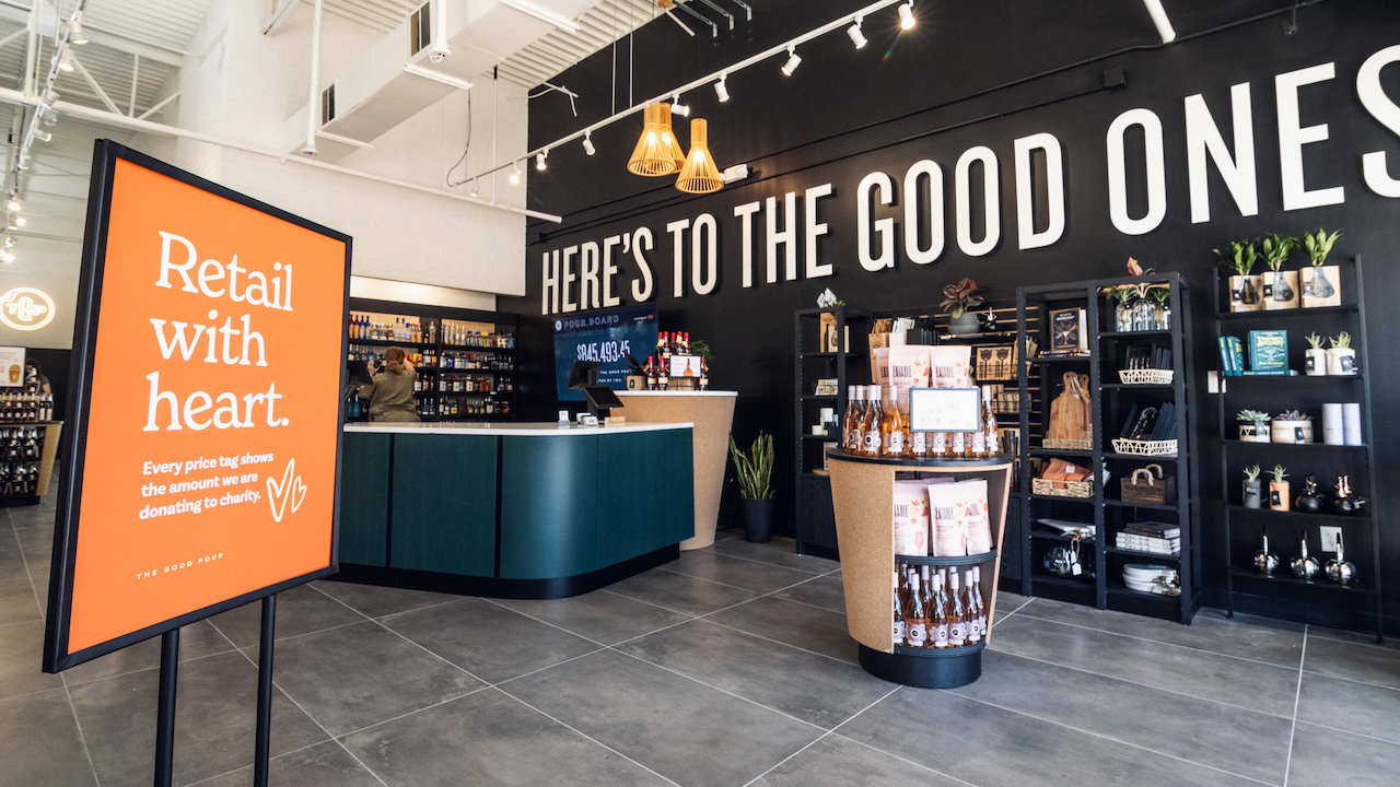
In other cases, the wordmark serves a secondary role alongside a symbol or logo. For these brands, the primary logo grabs attention, while the typography used throughout touchpoints such as websites, environments, or advertisements reinforces the brand’s character. For example, a healthcare brand might have a calming, modern logo paired with easy-to-read sans-serif fonts across its digital and print applications. On the other hand, a tech start-up might use bold, geometric typefaces to create a sense of energy and innovation.

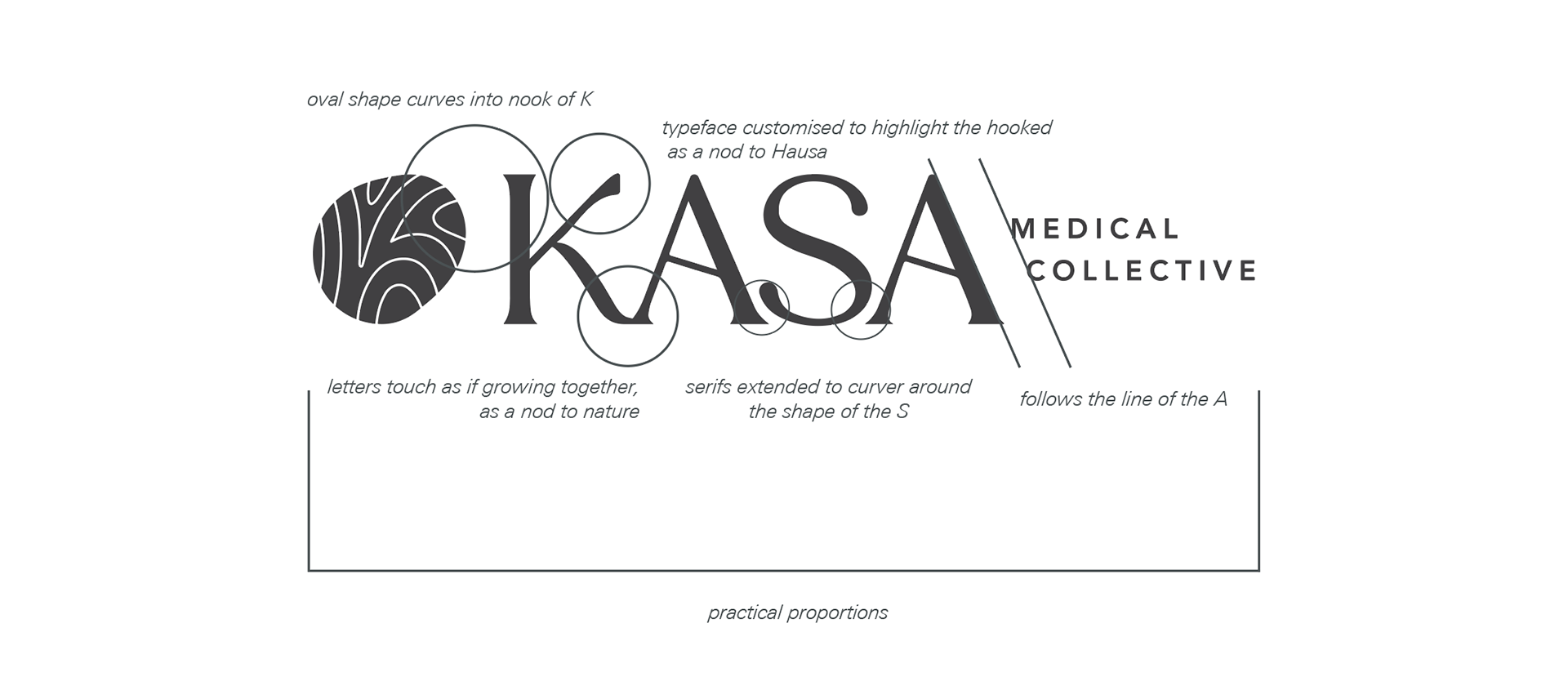
Kasa Medical Collective brings together independent practice groups to become a beacon of holistic healing. The campus intertwines care, community, and innovation, promising a brighter, healthier future. Our K is customized to include the Hook to indicate the Hausa language, and we have tweaked letters to touch and fit into each other’s curves as if they are growing together. The confident personality comes through in the upper-case serif letterforms. Nurturing and compassionate personalities are present when linking the letters and softening the terminals.
THE POWER OF SECONDARY TYPOGRAPHY
Beyond the wordmark, brands often have secondary typefaces in their toolkit to maintain visual consistency across platforms. These fonts are essential for body text, headlines, and promotional material. A well-chosen secondary typeface supports the primary identity and keeps communication unified. For example, it ensures an annual report or email campaign looks cohesive and “on brand” no matter where seen.

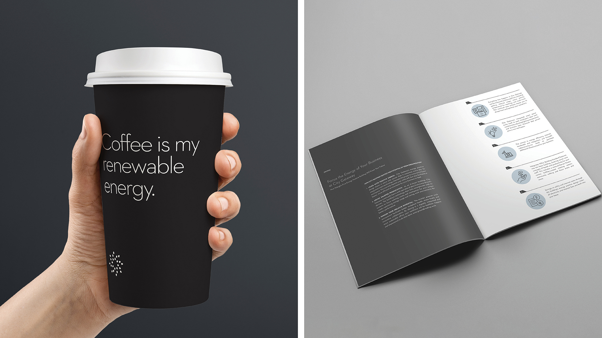
City Gateway’s logo does a lot of heavy lifting to convey the sense of progress and energy. Little created the brand and prepared several documents that targeted different end-users, all designed to communicate technical information clearly. The secondary typography selected for headlines and body copy is clean and minimal, emphasizing the modern and high-tech aspects of the project.
A STRATEGIC AND COLLABORATIVE APPROACH
Typography isn’t a one-size-fits-all solution. At Little, our Brand Experience team explores a variety of typefaces for each project, understanding that the most minute details—such as whether a letterform feels rigid or flowing—can impact how the brand is perceived. We dig deep into the brand’s needs, audience, and touchpoints to find beautiful typefaces that serve a strategic purpose. Whether building a restaurant identity or refreshing a corporate brand, our goal is to find the perfect blend of aesthetics and function through typography.
Typography is a critical element of branding that helps shape the entire experience. From custom wordmarks to carefully selected secondary fonts, every choice contributes to telling a cohesive brand story. The right typography not only enhances a brand’s visual appeal but also ensures its message resonates with its audience. With thoughtful typography, the brand’s voice becomes tangible, turning letters into an immersive, memorable experience.

