Little
Brightleaf
Historic Revitalization
Durham, NC
Project Type
Civic & Cultural, Hospitality & Entertainment, Mixed-use
Size
8,850 Square Feet
Design Services
Brand Experience, Engineering, Site Design
Result
A reimagined courtyard and Main Street presence, resulting in a 30% increase in new leases.
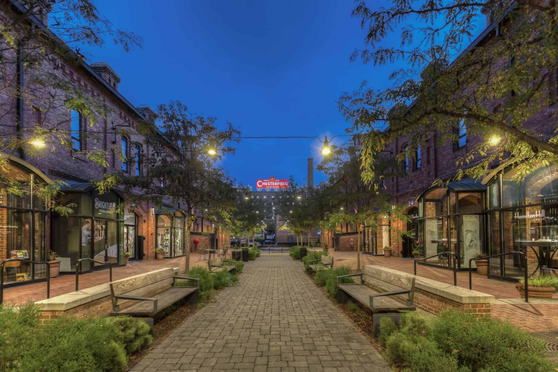
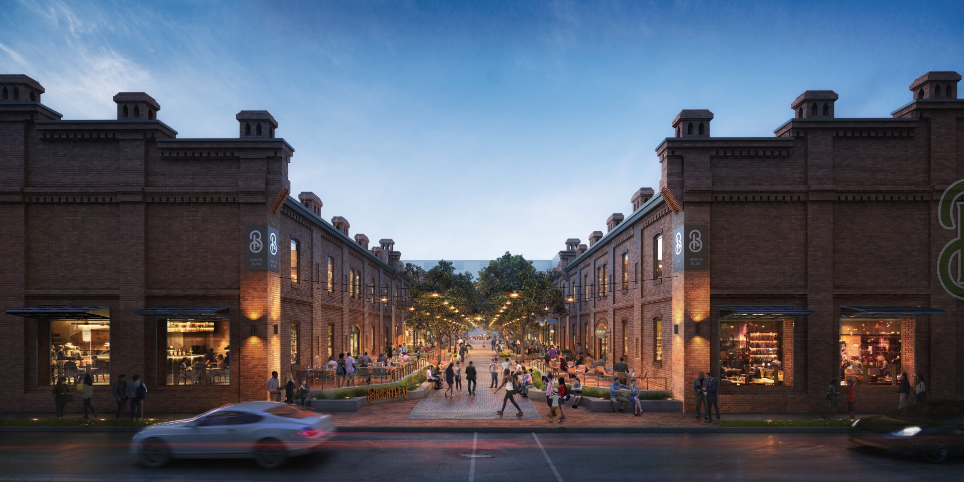
Constructed in 1904, the Brightleaf courtyard was originally a working space between two bustling tobacco warehouses. Its transformation gave rise to a fresh brand identity and the emergence of a sustainable destination.
Steeped in history, Brightleaf Square has emerged as a cherished landmark in Downtown Durham, N.C. Once storing the prized bright leaf tobacco that fueled Durham’s turn-of-the-century economy, these warehouses evolved into a public square. Now, the dynamic landscape of Durham has prompted a new role for this iconic space.
Project Goals
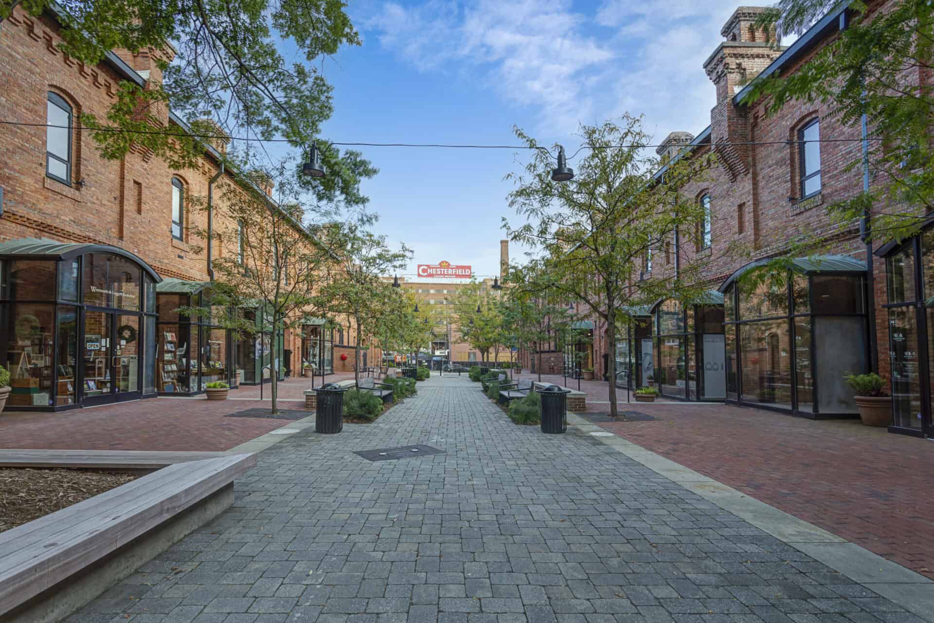
What began as an effort to address accessibility and pedestrian challenges evolved into a grander vision to reimagine the area as the vibrant heart of a larger Brightleaf district.
Primarily led by Little’s landscape and brand experience teams, this expansion aimed to connect, revitalize, and redefine the district’s identity while keeping sustainability top of mind. The design reused existing materials, added more resilient plants, incorporated strategies to reduce the carbon footprint and created a new brand identity, supported by new wayfinding and placemaking signage.
Objectives
- Refresh and reinvigorate the courtyard with sustainability at the forefront
- Reclaim the courtyard’s presence as a historic landmark
- Draw pedestrians into the space with a central walkway and comfortable seating areas
- Activate retail spaces by blurring the lines between indoor and outdoor
Solutions
Little revitalized an urban district through the collective efforts of an integrated design team. Spanning various practices and offices, Little teams collaborated seamlessly to transform the mixed-use space into a unified “downtown district” with a comprehensive approach that included branding, environmental graphics, public realm enhancements, and building renovations/additions. Sustainability was a consistent and central focus throughout the entire project.
A Sustainable Approach to Landscaping
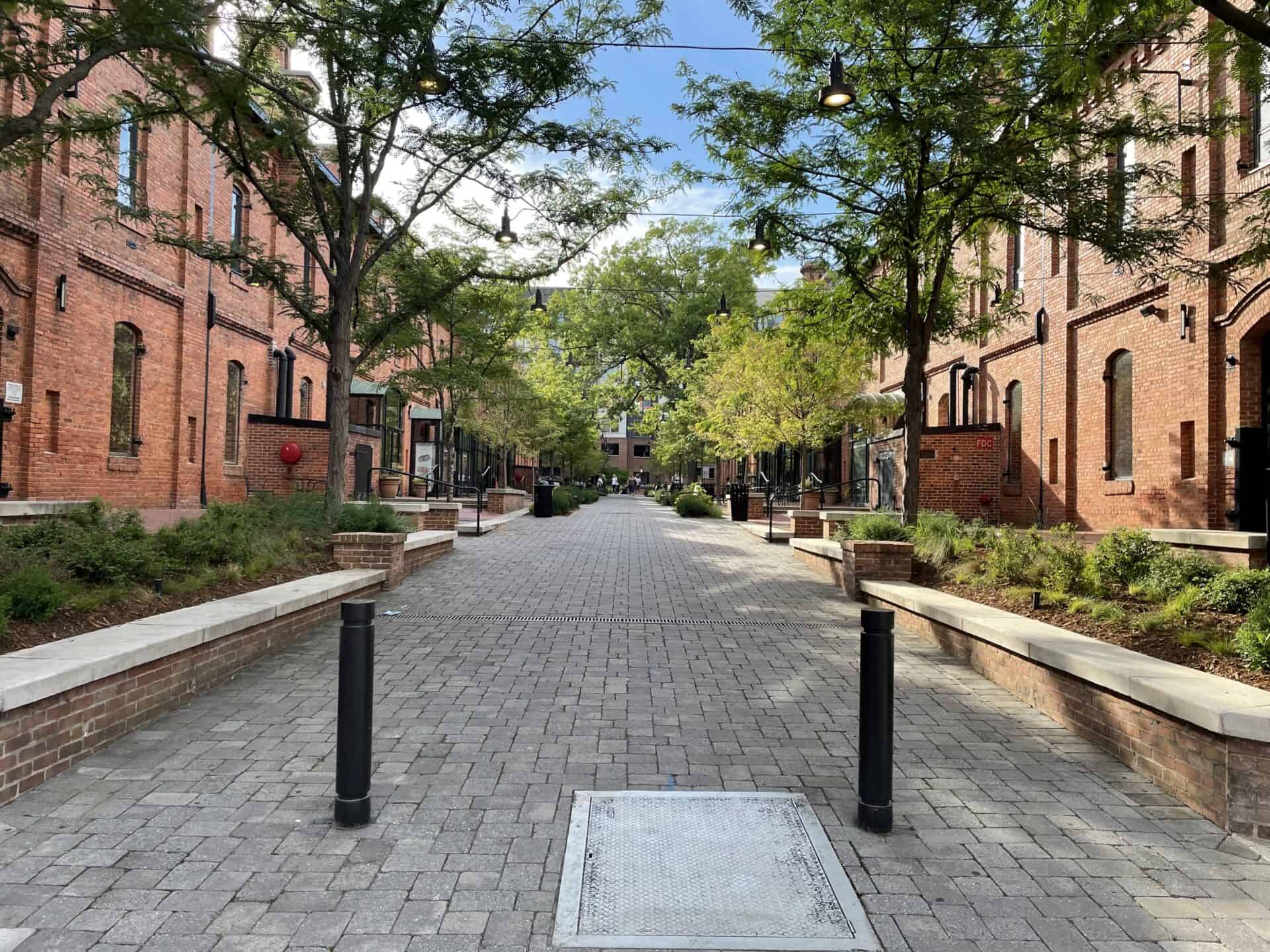
The design plan established a resilient plant community to densely cover the ground, reducing maintenance and allowing plants to grow and fill in naturally over time.
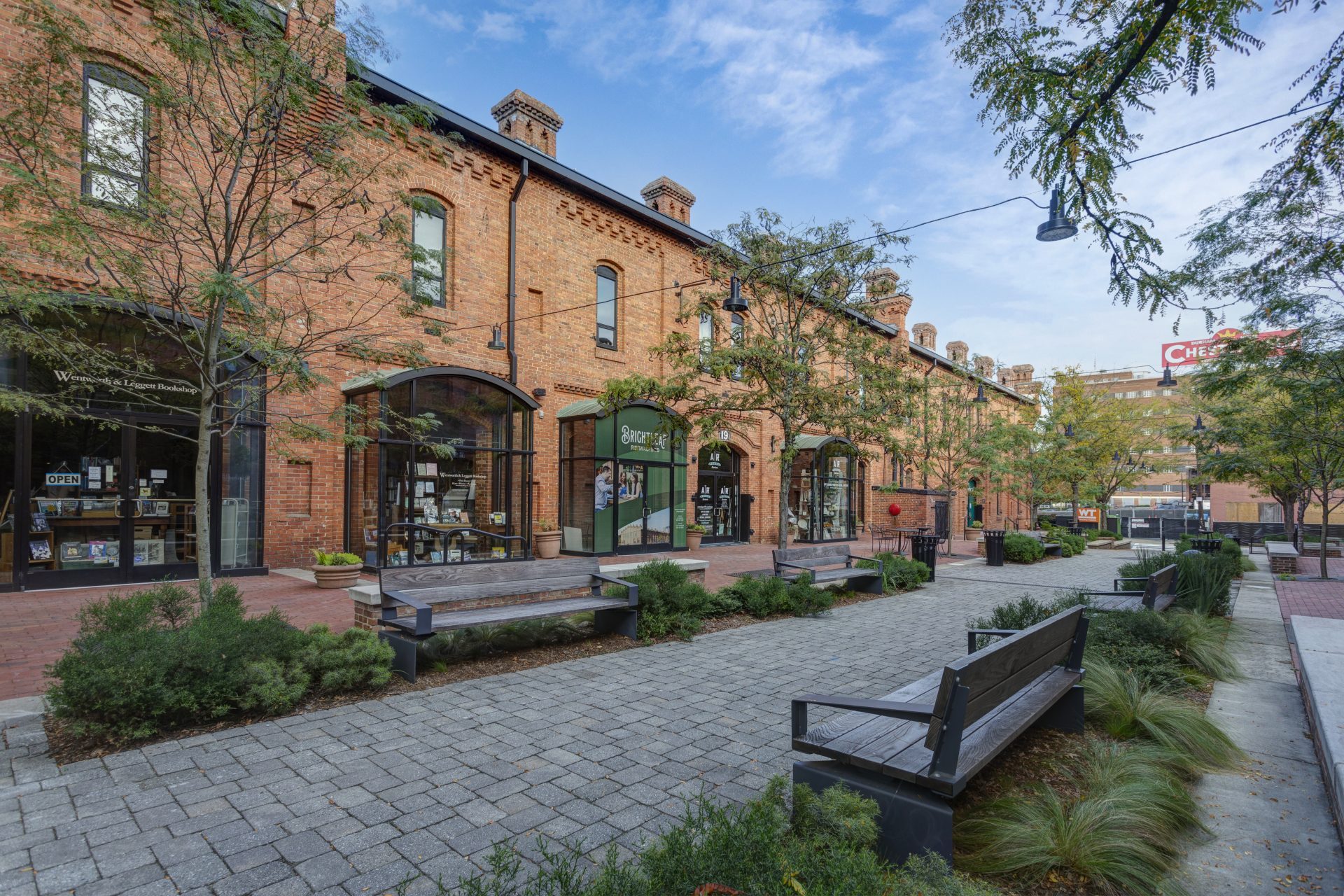
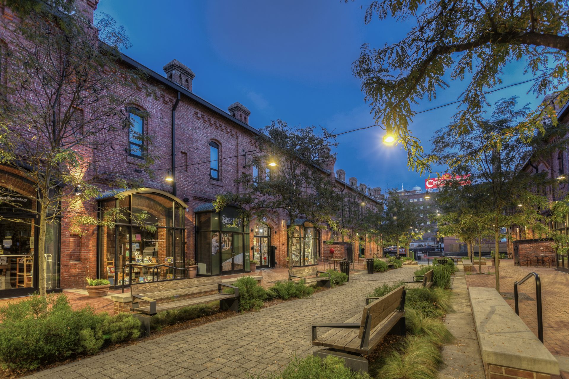
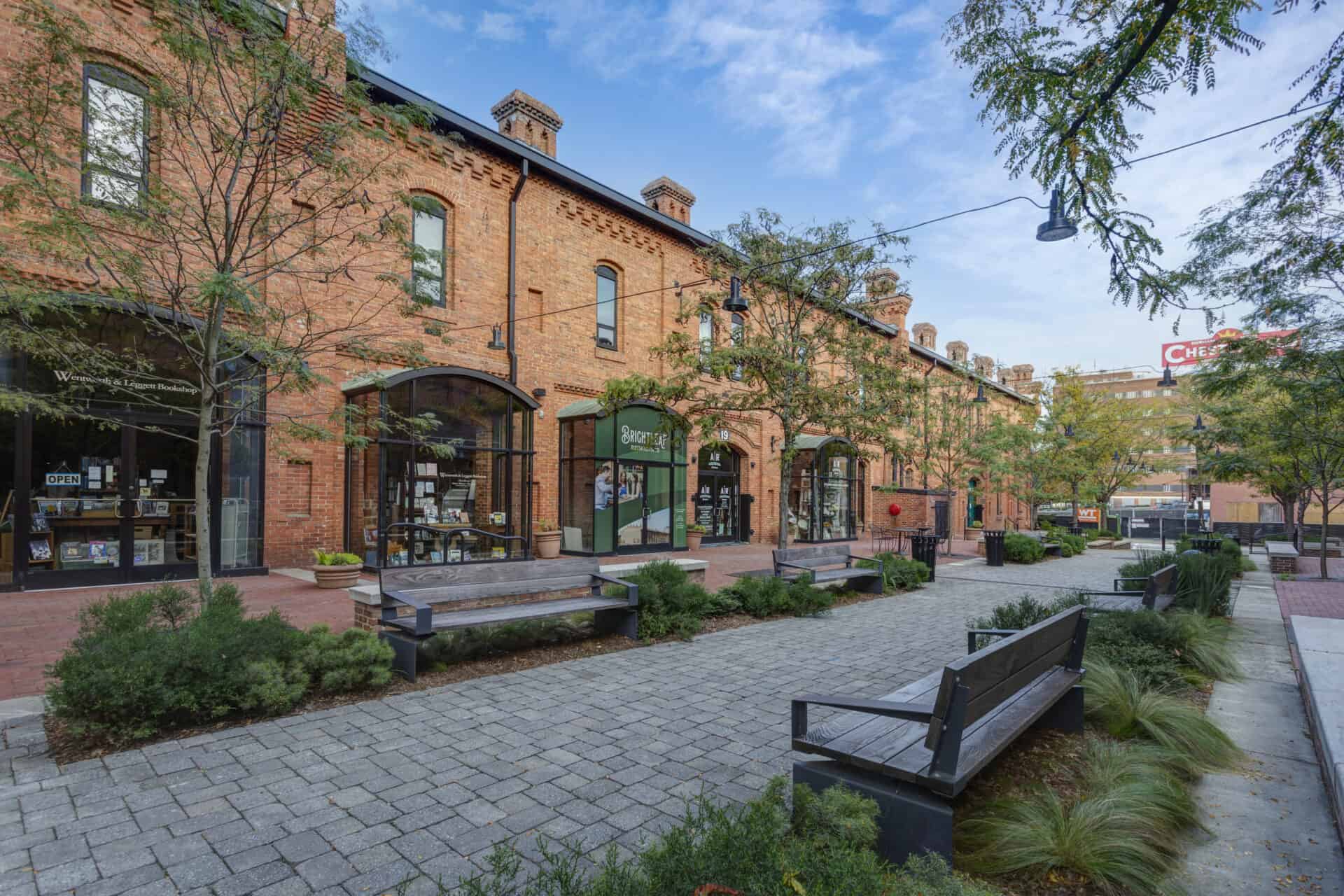
The plant beds are full of low-maintenance native sea oats that provide seasonal interest and are reinforced by environmentally friendly Corten steel walls, significantly reducing embodied carbon compared to traditional concrete retaining walls. Resilient Bald Cypress street trees, known for their ability to withstand heavy rains, provide shade in the courtyard. The incorporation of dense groundcover using evergreen sedges as a “living mulch” not only minimizes maintenance but also ensures year-round beauty. New benches made from thermally modified ash were chosen as a sustainable alternative to tropical hardwood.
Minor Updates, Major Impacts
Make strategic – almost surgical – changes to the existing space to refresh and reinvigorate the courtyard.
The two-tiered pedestrian walkway along the entire building edge was expanded to create a front porch facing West Main Street. Removing awnings and opening entrances allowed the landscape and building to work together to create a bright and inviting experience. Numerous pole lights and obstructive signs were removed, reducing visual clutter and offering unobstructed views into the space. To further help draw the public in, overhead catenary lighting is suspended from wires anchored to the two warehouse buildings. These lights cast a soft, even glow, inviting pedestrians to explore the courtyard.
Refreshed Brand Identity
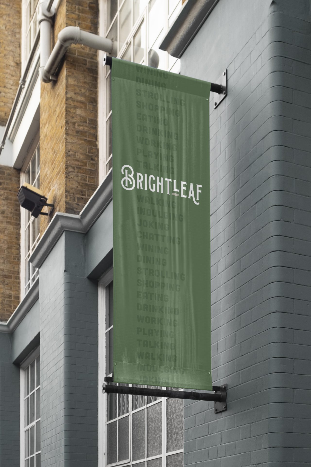
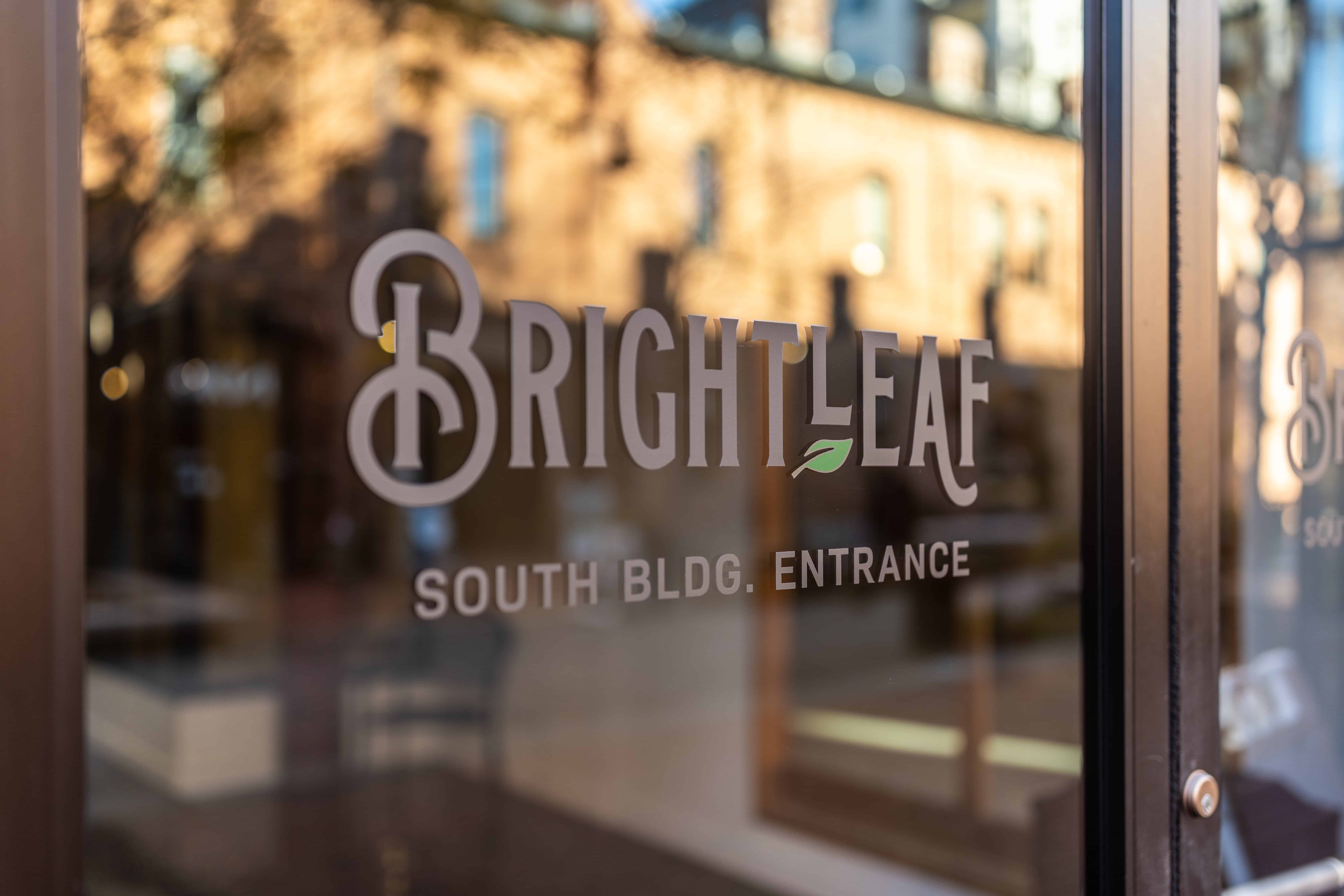
A brand package was developed that embodies a harmonious blend of muted aesthetics, a vibrant and approachable destination feel, and a deep connection to local history.
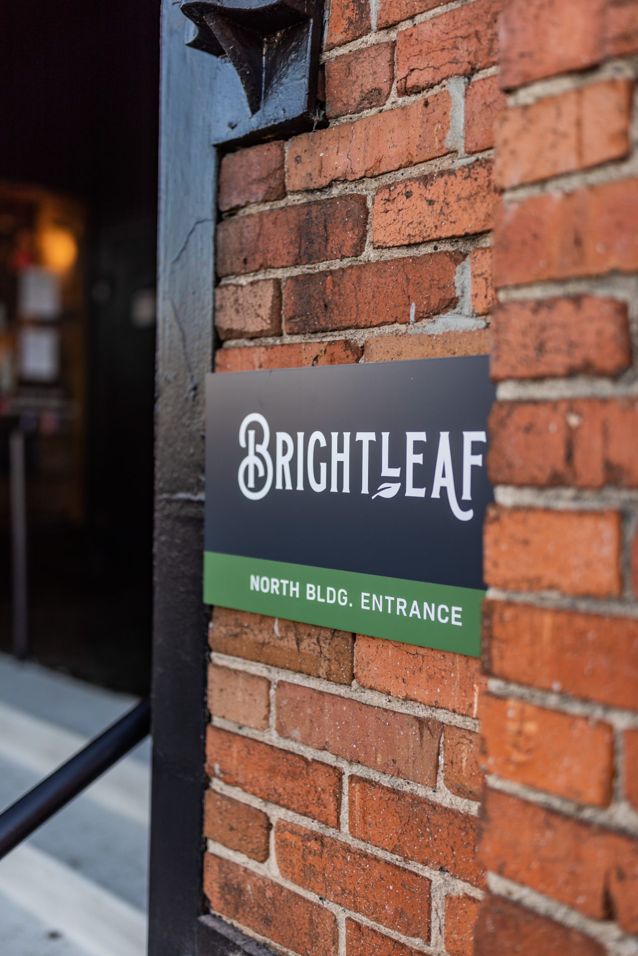
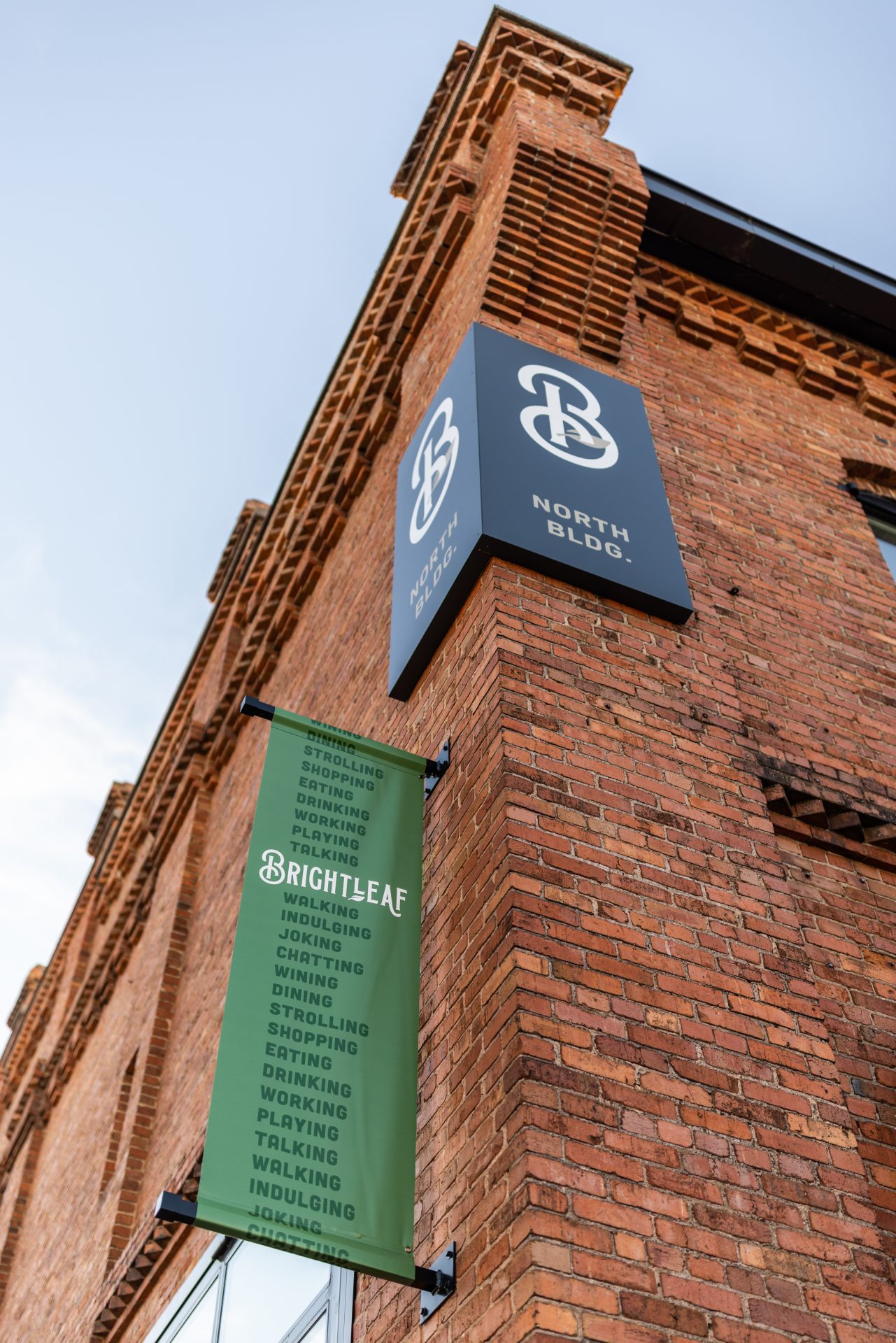
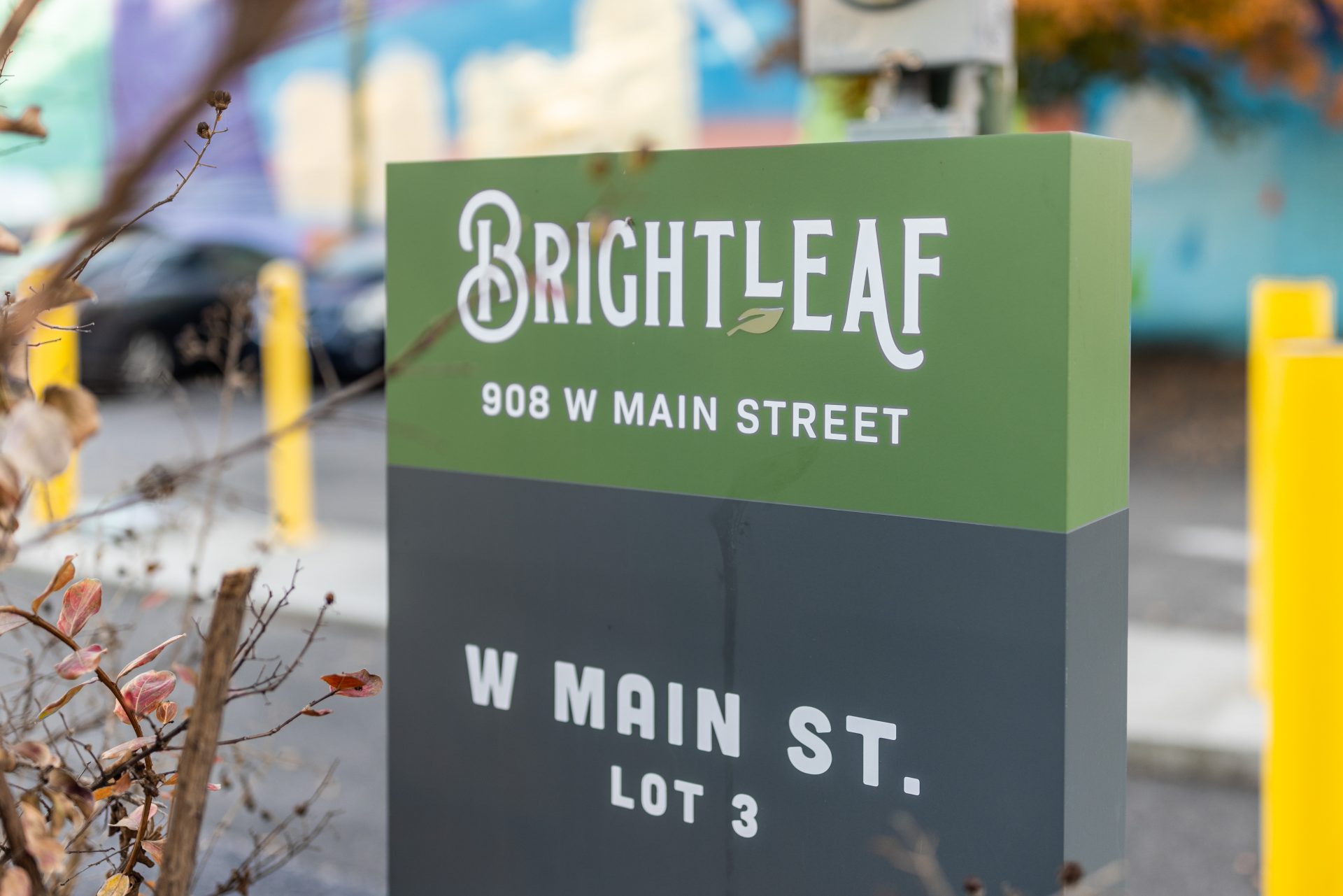
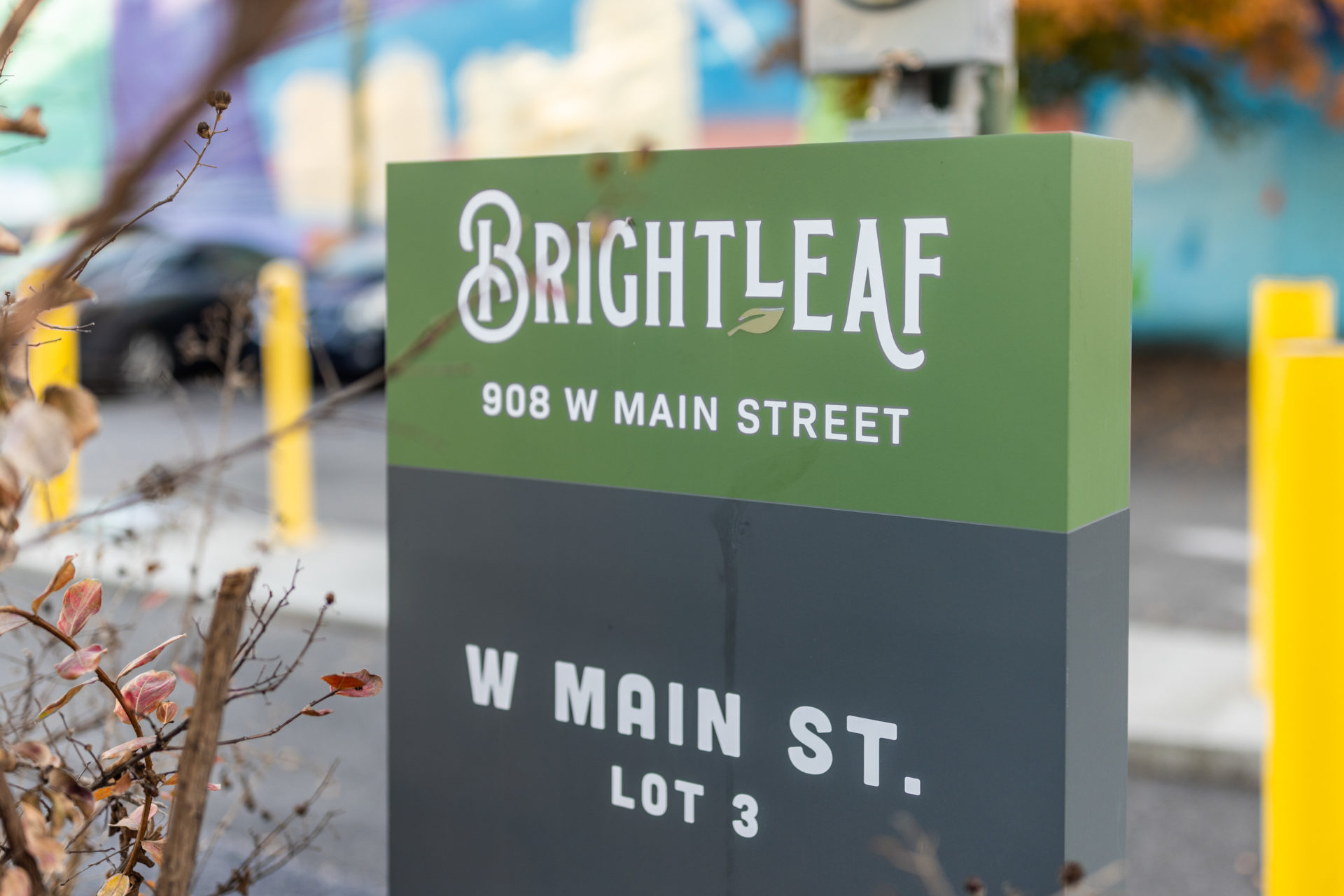
Little’s brand experience studio crafted a cohesive visual identify for the reinvigorated Brightleaf brand. Inspired by nature, the color palette features muted colors that evoke a sense of refined timelessness. The design team developed a new logo that captured the essence of a vibrant and approachable destination rooted deeply in local history. Wayfinding and signage elements were thoughtfully designed to seamlessly integrate into the surroundings, providing a navigational experience that aligns with the brand’s welcoming and historic character.
“These renovations have defined a new beginning for the Brightleaf district through the common language of sustainable materials, prioritizing the pedestrian, and celebrating historic warehouse architecture. In addition to reinvigorating the public district, the work has successfully attracted new businesses to the area.”
– Asana Partners
Results
Little successfully transformed the historic Brightleaf courtyard into a sustainable and vibrant urban destination, resulting in a 30% increase in new leases.
